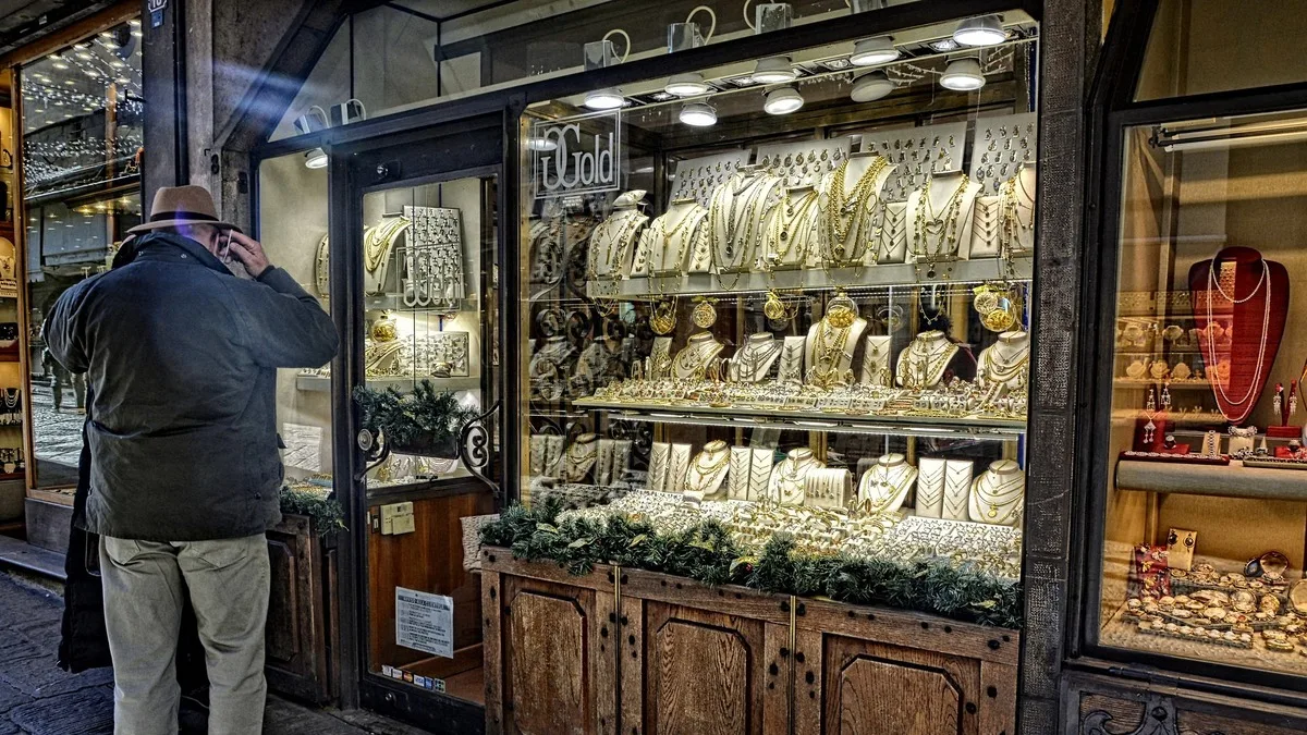
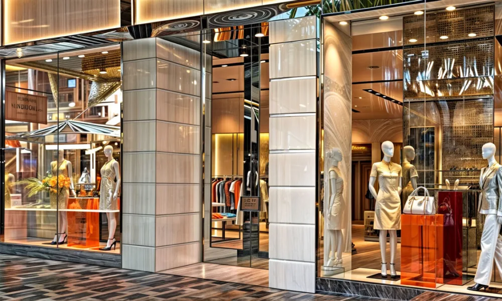
A ring catching the light, the polished surface of a watch, or a necklace positioned inside a carefully illuminated display can be enough to make someone stop on the sidewalk. Before a customer enters the store, the glass has already influenced how the collection—and the business itself—is perceived.
In a jewelry store, that glass may also form part of the security strategy. Storefronts, entrances, and exposed display areas need to protect high-value merchandise without obscuring the products behind them.
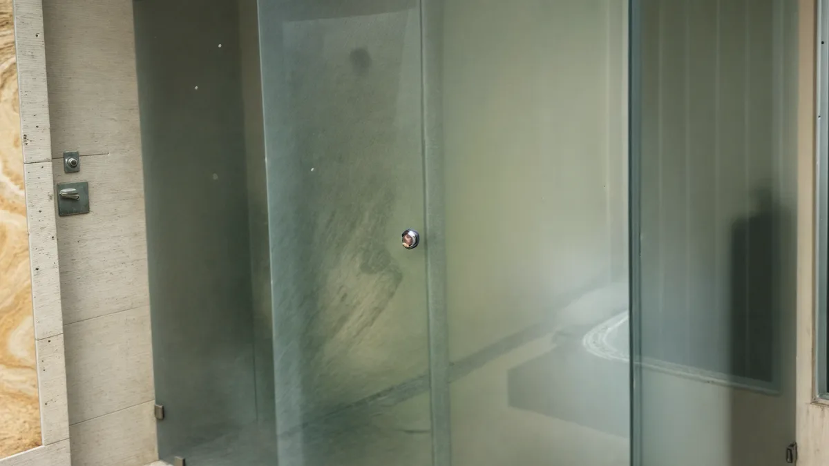
This creates a challenge that is easy to overlook. Bullet-resistant glazing is generally thicker and more complex than conventional glass. As additional layers are introduced, the natural tint of the materials can become more visible. In a store where subtle differences in warmth, brilliance, and finish matter, the optical character of the protective glazing becomes part of the display design.
Why Thicker Glass Can Create a Greener View
Standard clear glass contains iron oxide, which gives it a slight green tint. The effect is often most noticeable along the edges and may go largely unnoticed in an ordinary window.
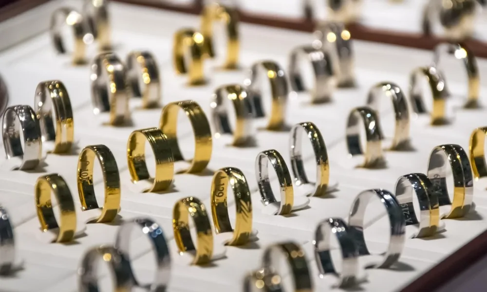
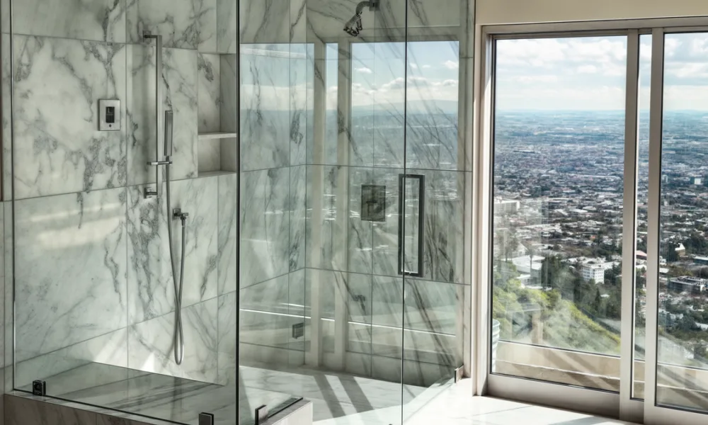
Jewelry displays create different viewing conditions. Products are seen from a short distance and under lighting selected to reveal small differences in color, reflection, and surface finish. A tint that seems insignificant elsewhere can become more apparent in front of a carefully arranged collection.
The thickness and composition of the glazing help explain why this happens. Bullet-resistant systems may combine multiple layers of glass, polycarbonate, acrylic, and specialized interlayers, depending on the required performance. Light must travel through the entire assembly before reaching the viewer.
As the amount of material increases, the natural green cast of standard glass may become more noticeable. This shift can subtly influence the perceived warmth of gold, the neutrality of white metals, and the appearance of clear or lightly colored stones. The final result also depends on the display lighting and the composition of the complete glazing assembly.
Low-Iron Glass Improves Clarity, Not Ballistic Performance
Low-iron glass contains less of the iron oxide responsible for the green tint in conventional glass. It offers higher visible light transmission and a more color-neutral view, particularly in thicker or multilayer configurations.
When used within bullet-resistant glazing, low-iron glass can help preserve the visual character of the products behind it. The benefit is optical: jewelry appears through a clearer substrate with less influence from the glass itself.
Low-iron glass does not make an installation bullet-resistant on its own. The required protection still depends on the complete system, including the number and composition of its layers, the interlayers, framing, anchoring, and the ballistic rating specified for the project.
Standards such as UL 752 evaluate bullet-resistant materials and assemblies under defined test conditions. The appropriate system should be selected according to the identified threat rather than assuming that every product described as “bulletproof” offers the same protection.
Bullet-resistant glazing is not indestructible. Depending on its composition and rating, it may crack, deform, or show visible damage during an impact while continuing to resist penetration and limit hazardous fragments under the conditions for which it was tested.